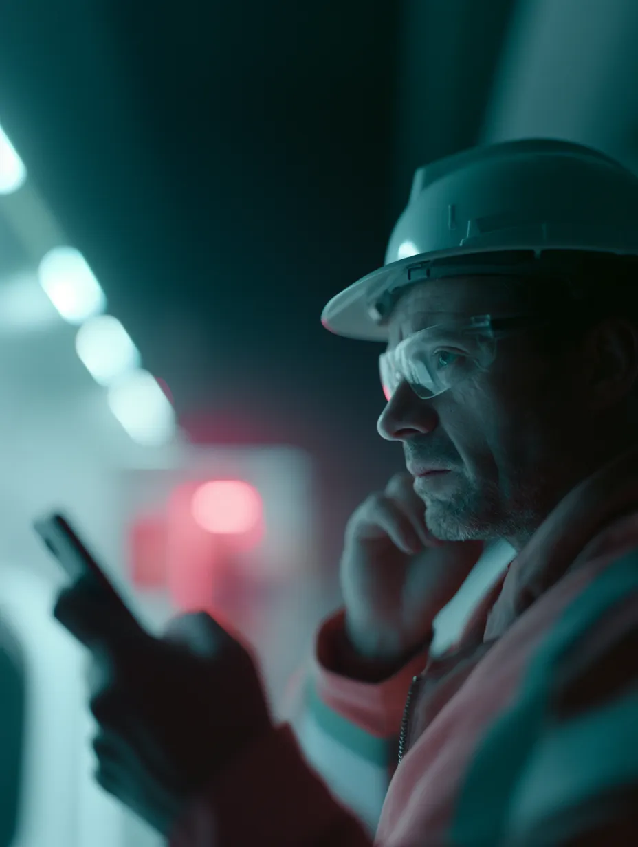
2016–2018
Designed in 2016, still running a decade later
Lone-worker safety depended on connecting detection, location, escalation, and response across unreliable environments.
- Role
- Product design across mobile, web, and IoT hardware, plus illustration and animation
- Duration
- 2016 to 2018
- Method
- Design thinking and continuous user validation inside a waterfall process
- Tools
- Adobe XD, Illustrator, ProofmeHQ, Trello
The system had to work when the worker was either not looking at it or dealing with an emergency.
What changed
- Still in production
- iOS and Android apps live in 2026, expanded from oil and gas into mining, utilities, hospitality, and transportationfrom MVP scoped to oil and gas lone workers in remote Alberta
Projected by others, not measured here
- FirstNet Verified
- cleared for AT&T's dedicated public safety networkFirstNet, Sens-Net Canada data sheet, 2019
Executive summary. OnGuard explored connected worker safety in remote and hard-to-monitor environments. I designed across the field app, Emergency Response Centre dashboard, and connected-device interactions. The system linked detection, location, escalation, and response rather than treating safety as a single screen or device. Because detailed incident and usage figures are not publicly disclosable, the case study focuses on the operating model, constraints, design decisions, and the system that remains in production.
Assets from this period carry the Sens-Net branding, which the company later changed to OnGuard. The feature set described here is the 2016 to 2018 platform; the product has continued to develop since.
Distance turned working alone into a systems problem
Under Alberta’s OHS Code, a worker is working alone when they are by themselves and help is not readily available if something goes wrong. The requirements sit in Part 28, consolidated from the Working Alone Regulation that took effect in October 2000. Sens-Net started in 2014 to serve it.
In oil and gas that describes thousands of people: driving hundreds of kilometres a week on back roads to work with pump jacks and pressurized equipment, out of sight of anyone who could help.
The controls in place were not designed for that distance. Hourly check-ins interrupt the work and still leave up to fifty-nine minutes between an accident and anyone noticing. There are no colleagues nearby to spot a problem. Cellular coverage is unreliable in the places where the risk is highest. And safety equipment for lone workers had not kept pace with cloud computing or wireless, partly through underinvestment and partly because people who are not visible are easy to stop thinking about.
For employers this is also liability, insurance cost, and regulatory exposure. Any solution had to satisfy all of that without changing how the work gets done, because a safety system that slows the job down gets switched off.
An eight-step story designed the path to rescue
The team worked from a single narrative rather than a feature list. John has an accident. His phone detects the fall. It sends a notification. His manager is informed. The Emergency Response Centre locates the alert. Help is dispatched. Paramedics reach him. John recovers.
Eight steps, and design owns six of them. Storyboarding it made the stakes legible to stakeholders in a way a requirements document does not, and it exposed exactly where the system had to be certain rather than merely functional.
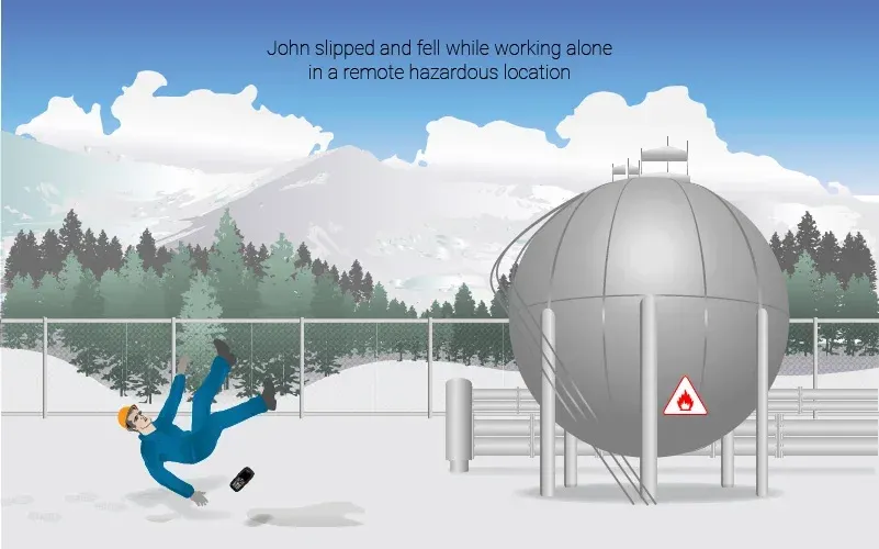
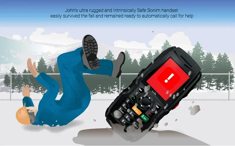
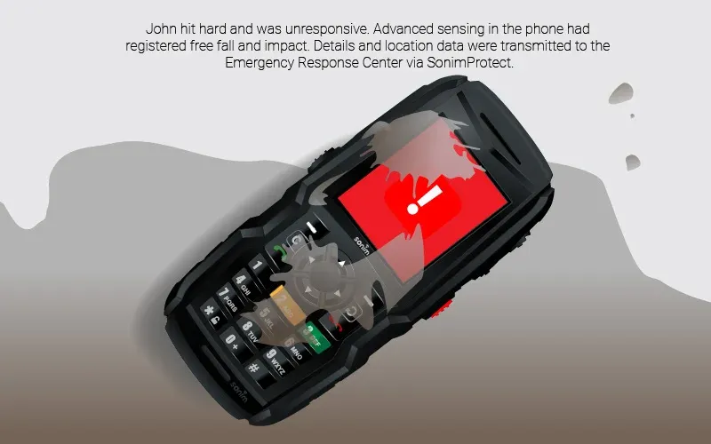
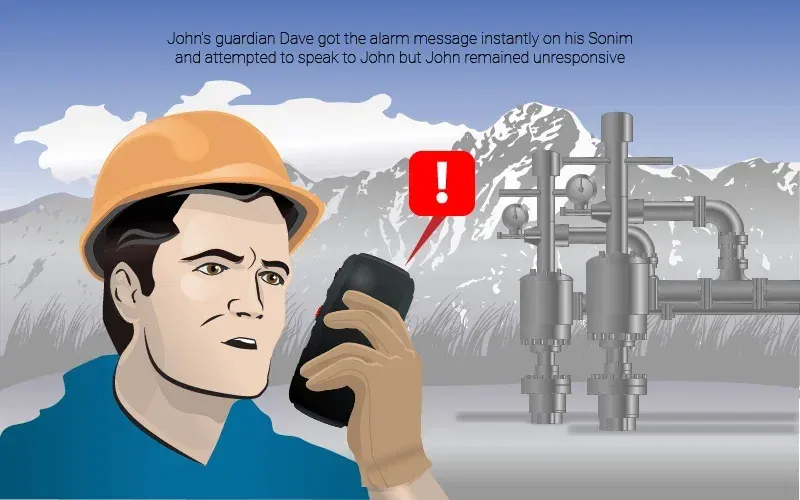
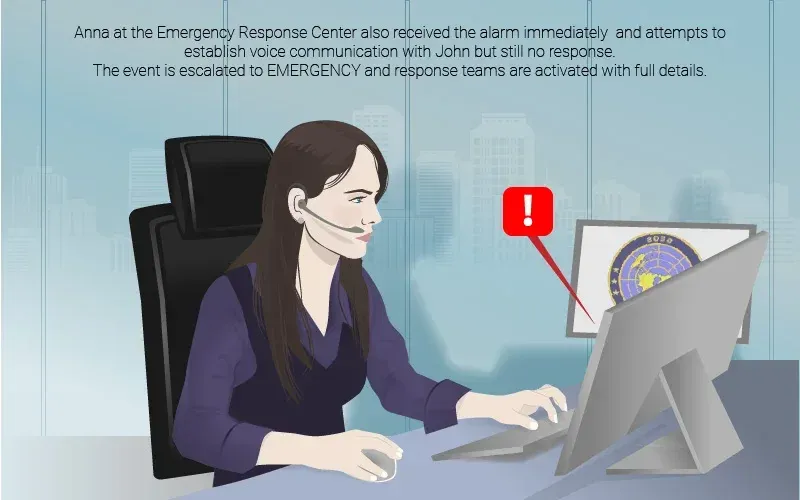
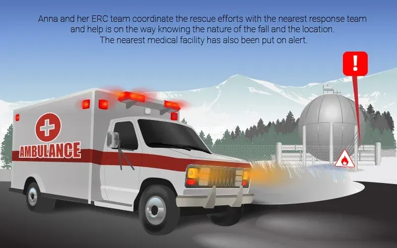
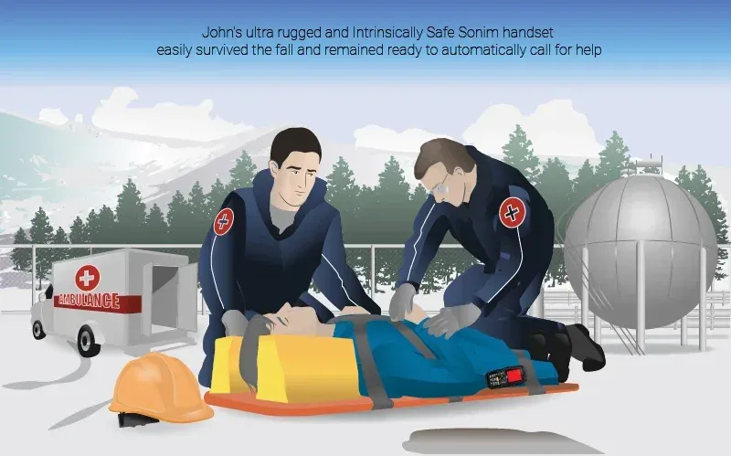
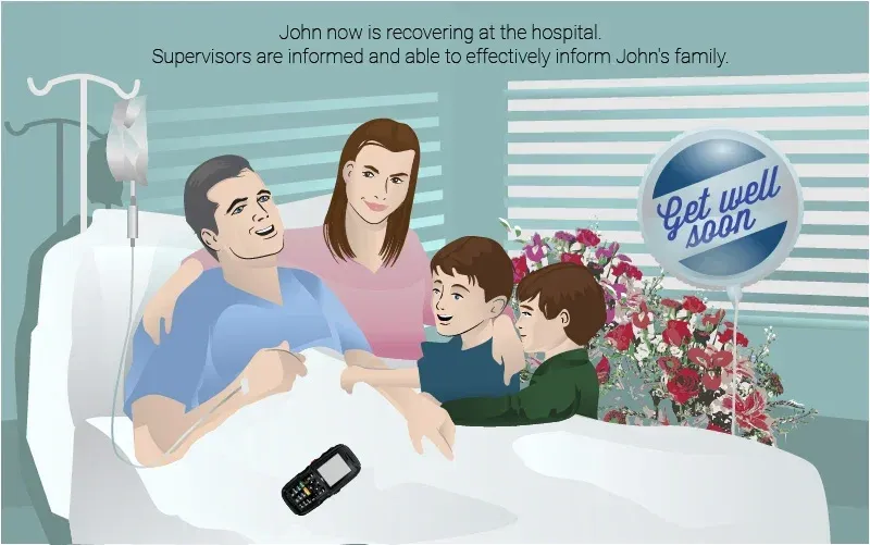
The eight-step storyboard that made the stakes legible to every stakeholder in the room.
Four alert types came out of it.
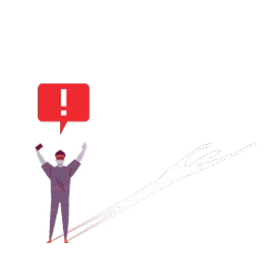
Panic button. Pressed on screen, on a ruggedised handset, or on a wearable, when the worker knows they need help.
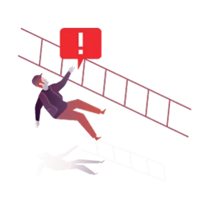
Fall detection. Sensors in Android handsets or connected wearables detect a fall followed by stillness, for when the worker cannot press anything.
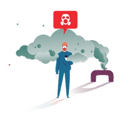
Gas detection. Gas detectors and heart rate sensors feed the response team the type of alert, not just its existence, so responders know what they are walking into.
Hazardous location geofencing. A boundary around a dangerous area alerts the worker on entry and raises an alarm if they stay longer than expected.
Calm monitoring and urgent response needed different interfaces
The Emergency Response Centre dashboard. Someone watches this all day, mostly while nothing happens, and must act correctly in the seconds after something does. It handles individual user management: active devices, profiles, location history, logs, properties. Responders can create and edit geofences and facilities, and configure what triggers an alarm or a check-in.
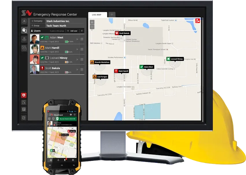
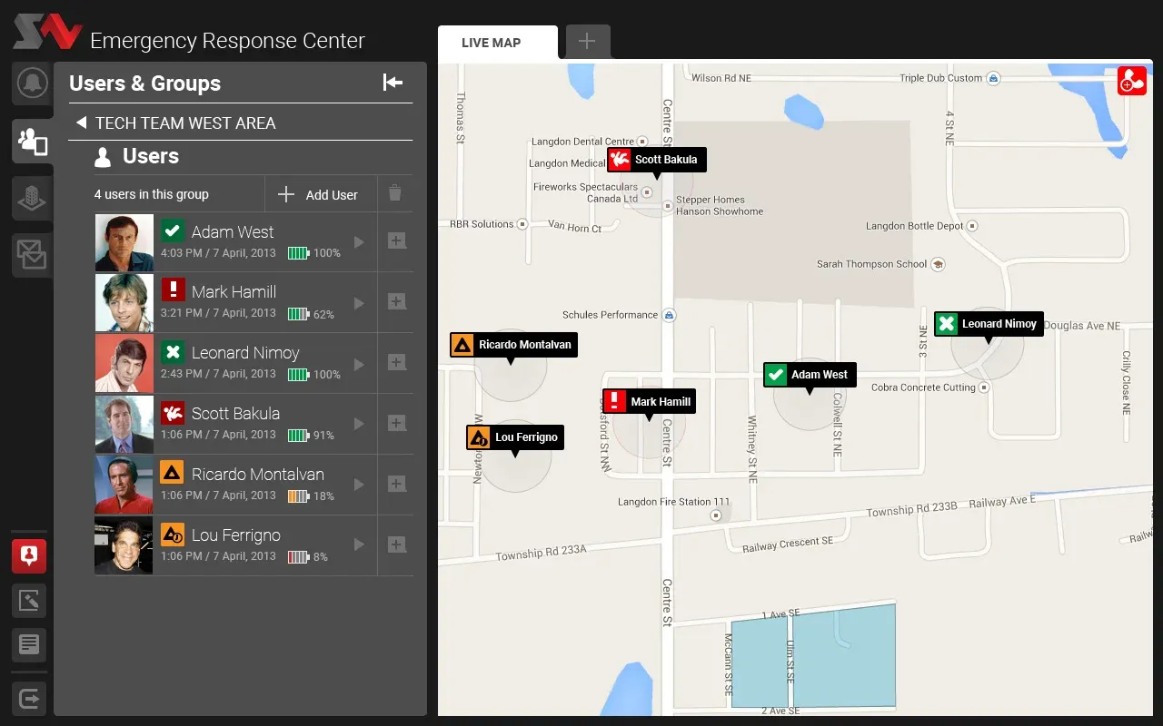
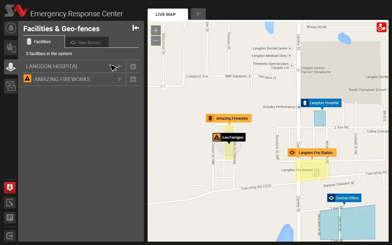
No interactive build survives from this project - these are archived screens from the shipped ERC dashboard.
The field app. Android, built for Sonim ruggedised handsets, using the physical emergency button in the hardware rather than an on-screen control. Customizable per client, because every operator’s protocols differ.
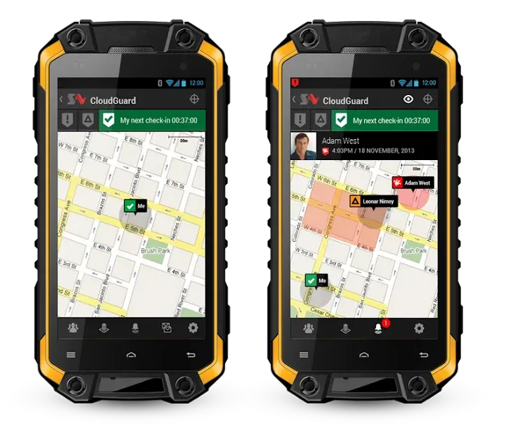
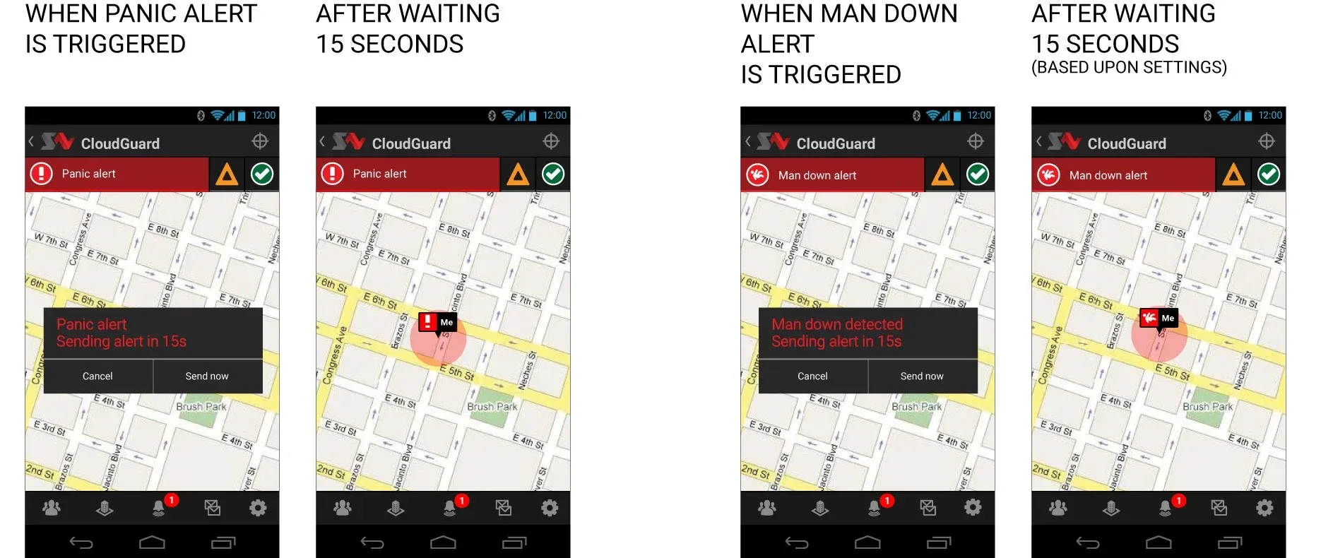
No interactive build survives from this project - these are archived screens from the shipped field app.
The design constraint that governed everything: a person using this is either not looking at it or having the worst day of their career. Nothing in between.
When incidents stayed private, evidence had to come from elsewhere
We were designing an emergency response system without much data about emergencies.
Clients would not talk about accidents. Not evasively, and not because anyone was hiding anything: incidents are legal exposure, insurance exposure, and reputational risk all at once, and a safety manager who describes what went wrong at their site in detail is creating a record. So we got policy, procedure, and the shape of a response, and very little of what actually happened when the response was needed.
When first-person incident accounts were unavailable, the team triangulated from the evidence around them.
That is a hard gap in this particular product. Almost every design decision hinges on the seconds after something goes wrong. How long before anyone noticed. What the responder did first. What information they wished they had. Where the protocol broke and someone improvised. We were designing for a moment we could only reconstruct secondhand.
What we did instead was work forward from the protocol and the storyboard, and rely on the people who had been in the room for the aftermath rather than the incident. It was enough to ship, and the platform has held up for a decade, which suggests the reconstruction was reasonably good. But I have never stopped noticing that we validated an emergency system against how emergencies are supposed to go.
If I ran it again I would go for the records rather than the conversations. Incident reports, insurance filings, regulator submissions. Documents get written because someone is obliged to write them, and obligation produces detail that a meeting never will.
High-stakes design changed when validation had to happen
Continuous user validation inside a waterfall process is a contradiction, and it took this project to show me when the contradiction is the right answer. In consumer software you ship, watch, and correct. Here, correcting after launch means correcting after an incident. So the validation had to happen before anything was built, which is slower, less satisfying, and in this context the only defensible sequence.
The project used staged validation to reduce the cost of being wrong before implementation.
I have not worked that way since, because almost nothing else justifies it. But knowing which kind of product does is the thing I took from OnGuard.
Similar projects
2013–2015
If an eighteen-year-old summer hire can survey a network, the tool works
MyMobileCoverage · Design lead, UX and industrial design
Carriers publish coverage maps. Customers live somewhere else. Survey backpacks, in-store kiosks, vehicle-mounted boxes, and a smartwatch-based voice quality tester mailed to people's homes.
Read case study
2014–2015
$152,875 raised from 911 backers by July 2015
MYLE Electronics Corp · Design strategy, UX, and product design
I worked across product, UX, positioning, and the crowdfunding campaign for a wearable connected to mobile apps, cloud services, desktop software, and third-party integrations.
Read case study