2019–2020
Both targets met in 30 days, over the holidays, during a code freeze
No single team owned the application flow end to end — until it was mapped on one wall, and the deposit screen became indefensible.
- Role
- Design lead
- Timeline
- 30 days to a fixed launch of January 6th
- Teams
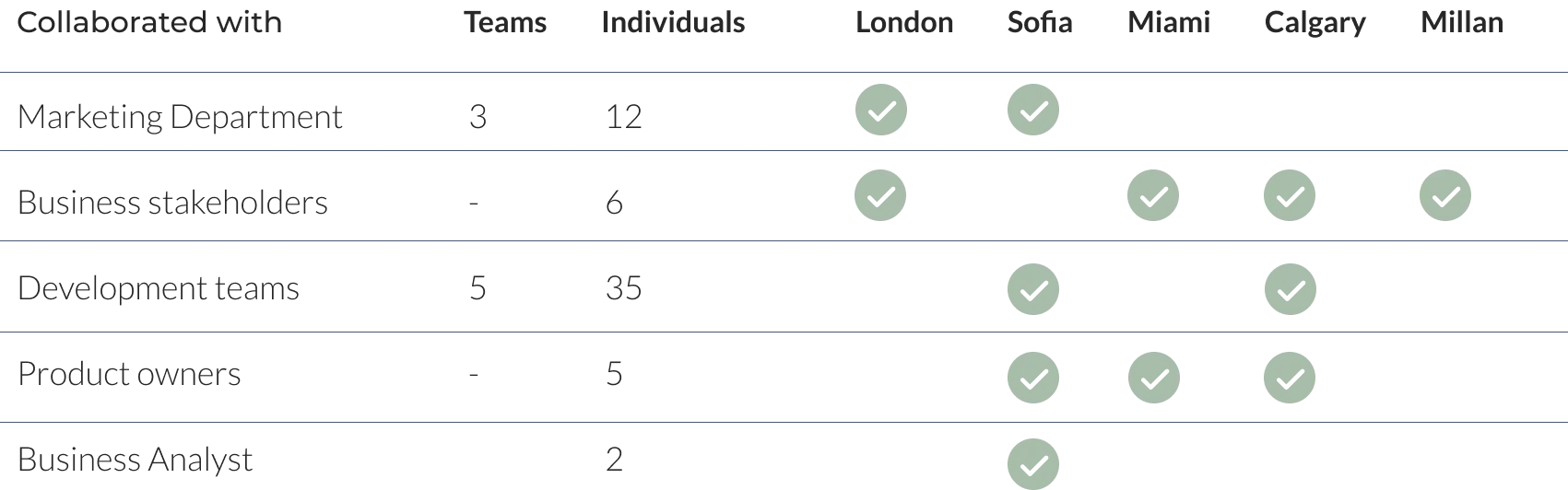
- London, Sofia, Miami, Calgary, Milan
- Targets
- 25,000 applications · 16,000 activations · €400K break-even
A shared journey map's absence is a symptom of organizational silos, not a documentation gap.
What changed
- Card applications
- 1,950 in the week of January 24–30, 2020from 315 in the same week a year earlier (+519%)
- Card activations
- 394 that week, 16,000 cumulativefrom 81 in the same week a year earlier (+386%)
- Apply page visits
- 59,762from 18,110 a year earlier (+230%)
- Sign-up page visits
- 25,531from ~6,122 a year earlier (+317%)
- Sign-up success page visits
- 7,618from ~1,642 a year earlier (+364%)
- Total sign-ups
- 8,301 in the week of January 24–30, 2020from ~5,461 in the same week a year earlier (+52%)
- Daily average sign-ups
- 593from ~388 a year earlier (+53%)
- KYC complete
- 1,245 totalfrom ~759 a year earlier (+64%)
- KYC completion rate
- 15%from ~13.9% a year earlier (+8% - reported as a plain percentage, not confirmed as points or relative)
- Activation rate
- 20%from ~18% a year earlier (+11%)
- CTA clicks
- 15,619from ~7,619 a year earlier (+105%)
- NPS
- 52from 32, September 2019
Projected by others, not measured here
- Projected ROI
- 369,000–738,000 euros, ARPU 25–50 eurosSkrill's own launch projection
Removing one deposit unlocked the Italian market
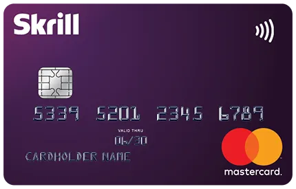
Skrill’s prepaid Mastercard let people spend their wallet balance without a bank account. In Italy that mattered more than elsewhere.
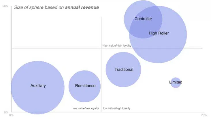
Twelve months of behavioural data split the user base into six segments, though the source research only ever named five of them. Four besides Auxiliary: Remittance (low-to-mid value, variable loyalty, sending money across borders, tracking exchange rates and competing services more than any one platform), Traditional (low value, variable loyalty, routine transactions with shallow engagement), Controller (high value, high loyalty, the most reliable segment for recurring revenue), and Limited (high value, high loyalty, large transactions and deep platform trust).
The one we called Auxiliary was low value and low loyalty: people using Skrill as a second account, mostly to keep sports betting money separate from their main finances. Betting was 58.5% of their transaction revenue. Italy held the largest concentration of them, alongside Greece, Spain, and Montenegro. Unlike Controller and Limited, who were already high-value and already loyal, Auxiliary’s disengagement traced to one removable barrier rather than a deeper mismatch with the product — the exact shape of problem a single UX fix could move.
The original segmentation and journey artifacts show how that opportunity became a cross-team decision.
They were the exact audience for the card, and they were not applying.
The application flow ran 33 steps and opened by demanding a 10 euro deposit before anyone could order a card. No single team owned it end to end. Marketing, product, legal, and UX each held a piece, spread across five cities.
The breakthrough was making every team’s local decision visible as one customer journey.
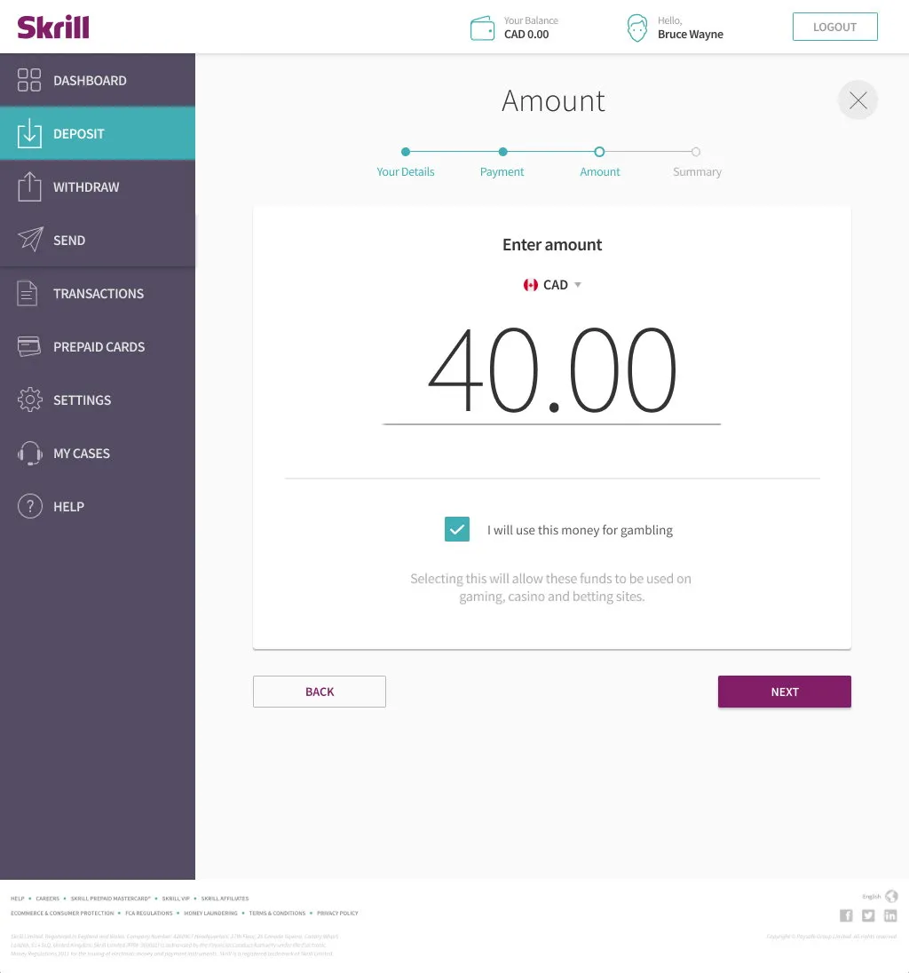
The screen every new applicant hit first, before they could even start a card application.
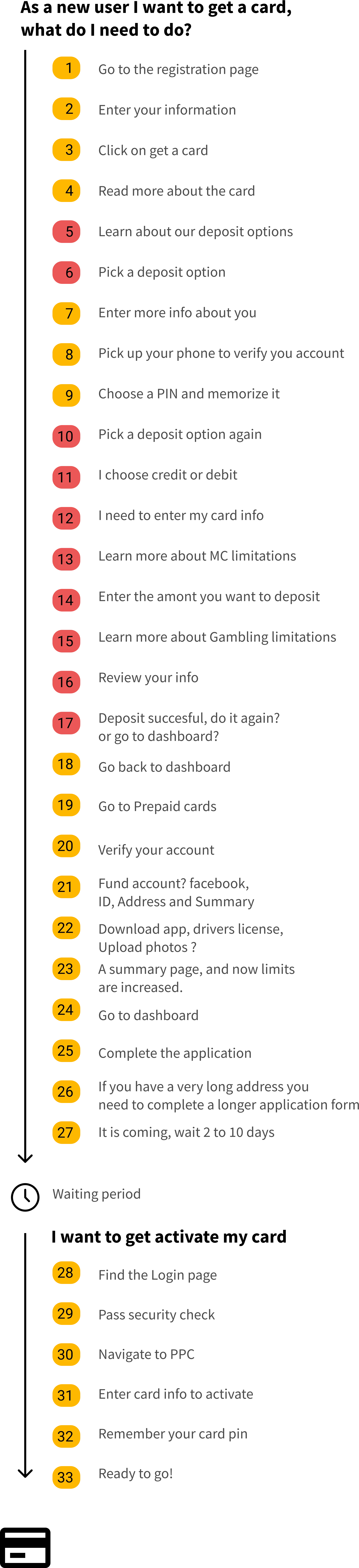
The full journey once it was mapped on one wall. The red steps are the deposit detour.
Read the 33-step flow as text
As a new user I want to get a card. What do I need to do?
- Go to the registration page
- Enter your information
- Click on get a card
- Read more about the card
- Learn about the deposit options
- Pick a deposit option
- Enter more info about you
- Pick up your phone to verify your account
- Choose a PIN and memorize it
- Pick a deposit option again
- Choose credit or debit
- Enter your card info
- Learn more about Mastercard limitations
- Enter the amount you want to deposit
- Learn more about gambling limitations
- Review your info
- Deposit successful - do it again, or go to the dashboard?
- Go back to the dashboard
- Go to Prepaid cards
- Verify your account
- Fund the account: Facebook, ID, address, and summary
- Download the app, driver's license, upload photos
- A summary page - limits are now increased
- Go to the dashboard
- Complete the application
- A long address needs a longer application form
- It's coming - wait 2 to 10 days
Waiting period
I want to activate my card.
- Find the login page
- Pass the security check
- Navigate to PPC
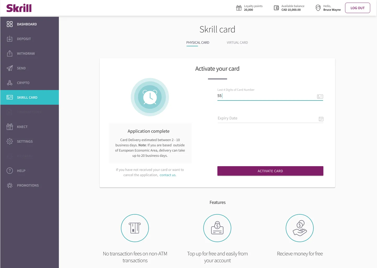
- Enter your card info to activate
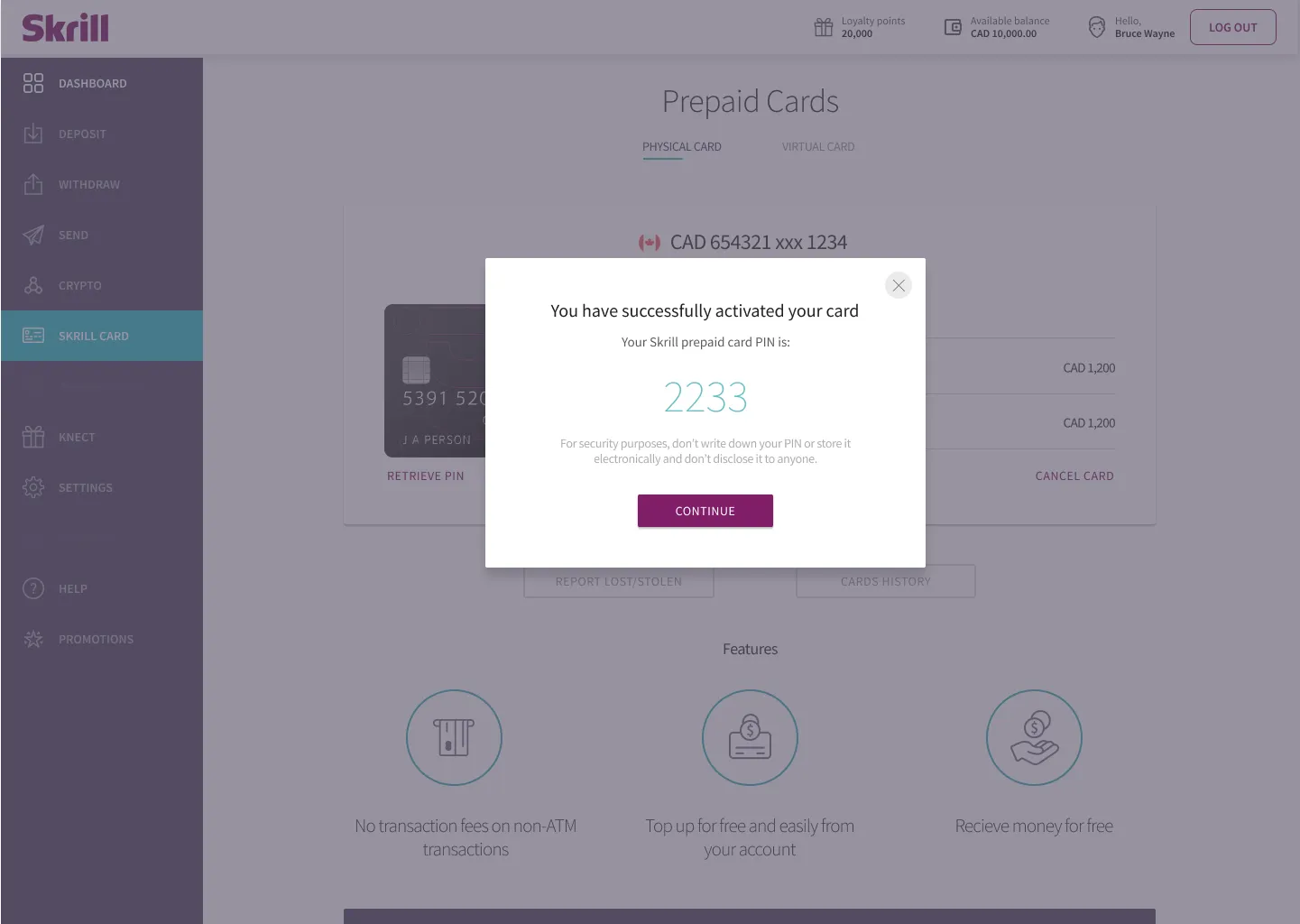
- Remember your card PIN
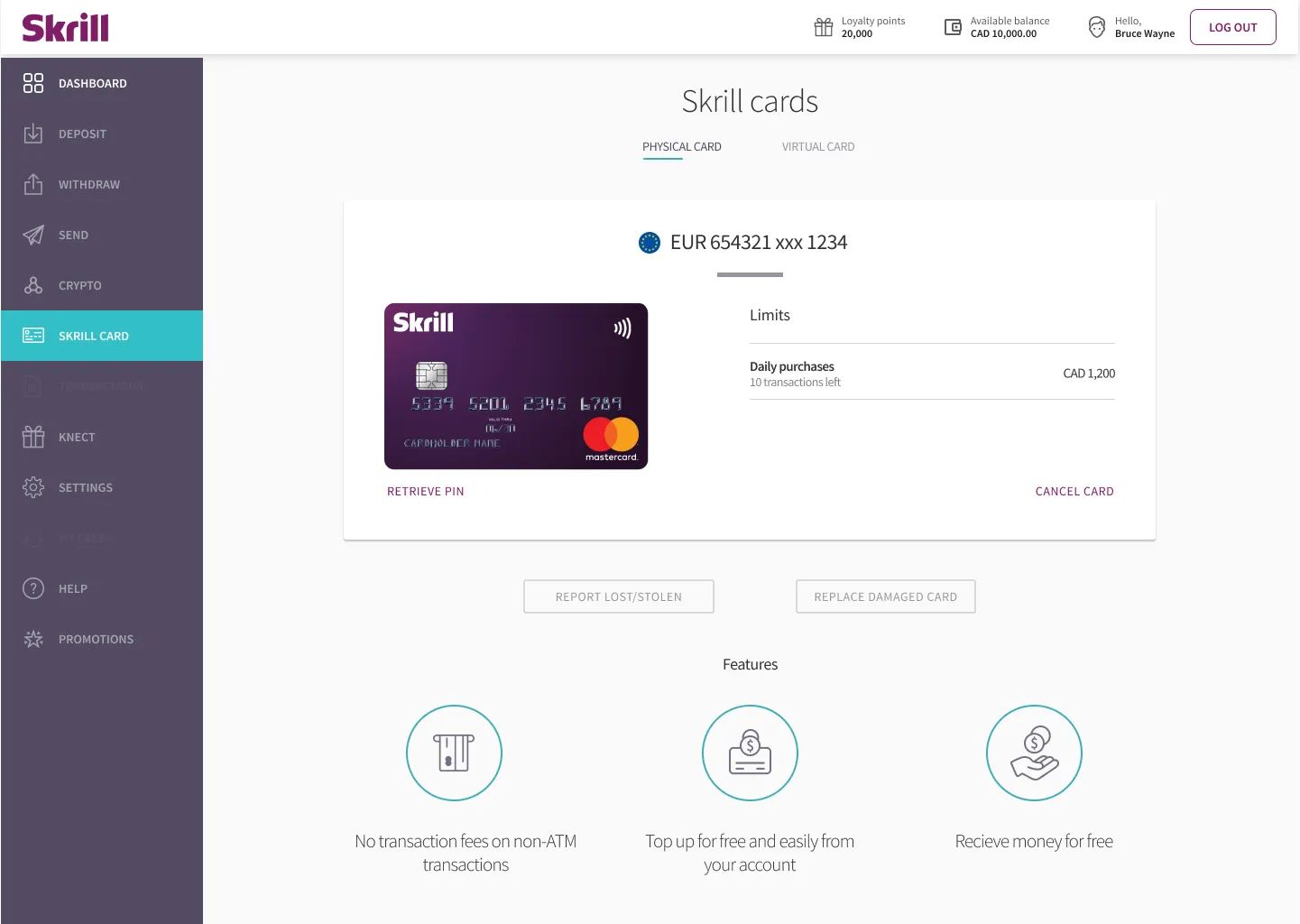
- Ready to go!
The economics were what made removing the deposit defensible. Acquiring a new customer in digital financial services costs real money once marketing, operations, and KYC validation are counted. Shipping a card to an Italian user cost comparatively little and carried low risk. The 10 euros was protecting almost nothing and blocking the funnel’s widest point.
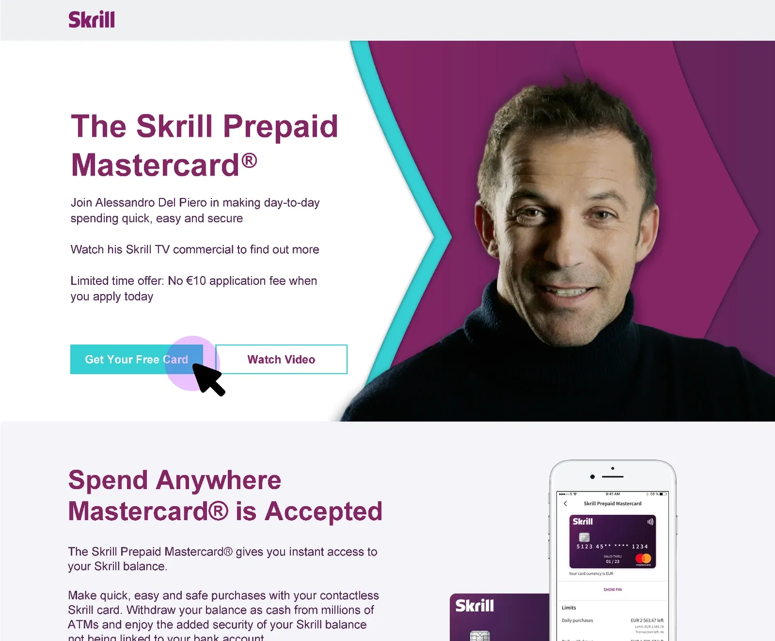
The deadline was set by a TV campaign already booked on Sky Sport Italia, fronted by Alessandro Del Piero, whose number 10 the creative reframed as the 10 euro fee now waived. Skrill CEO Lorenzo Pellegrino later cited the partnership as a centrepiece of the company’s 2020 marketing strategy, positioning the card as an accessible alternative to traditional banking for everyday transactions and sports betting.
Mapping 33 steps made the unnecessary visible
Nobody in the company had mapped the journey from registration to a card in someone’s hand. Doing that first did most of the work. Once 33 steps were visible on one wall, the deposit screen was indefensible, and so were the navigation loops, the repeated data entry, and the confirmation screens that added friction without adding value. For most of the product owners in that room it was the first time they had seen a new user’s card application end to end.
We removed the deposit requirement, then ran a full task analysis on what remained. The flow came down roughly 30%. Security did not move: SCA and KYC stayed exactly as they were.
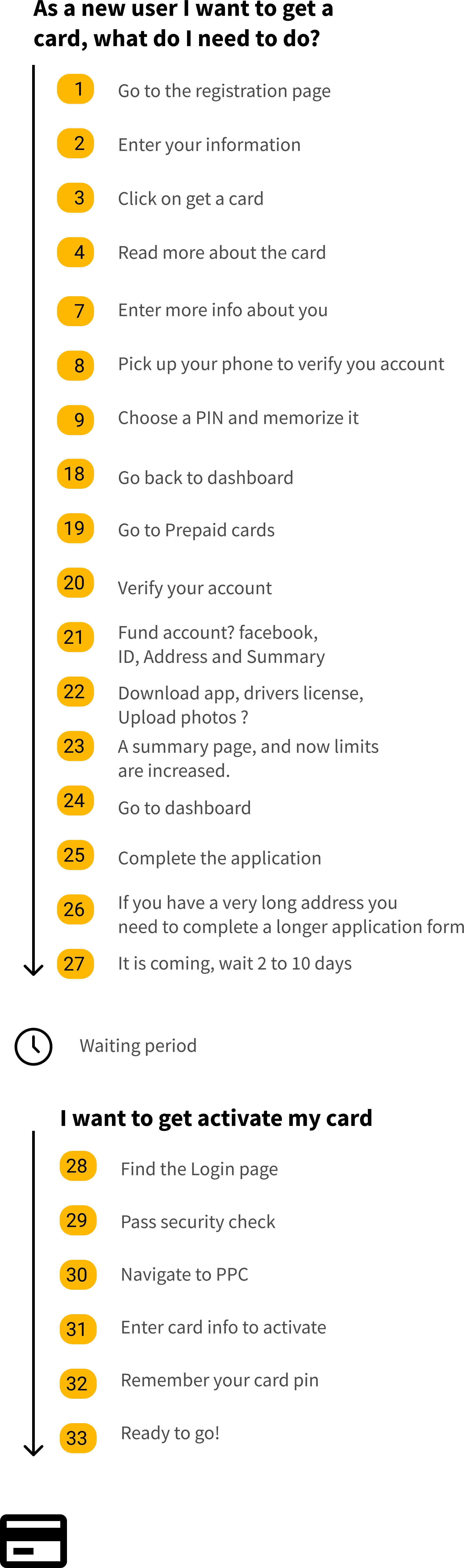
Same journey, deposit detour gone: 23 steps instead of 33.
Read the 23-step flow as text
As a new user I want to get a card. What do I need to do?
- Go to the registration page
- Enter your information
- Click on get a card
- Read more about the card
- Enter more info about you
- Pick up your phone to verify your account
- Choose a PIN and memorize it
- Go back to the dashboard
- Go to Prepaid cards
- Verify your account
- Fund the account: Facebook, ID, address, and summary
- Download the app, driver's license, upload photos
- A summary page - limits are now increased
- Go to the dashboard
- Complete the application
- A long address needs a longer application form
- It's coming - wait 2 to 10 days
Waiting period
I want to activate my card.
- Find the login page
- Pass the security check
- Navigate to PPC
- Enter your card info to activate
- Remember your card PIN
- Ready to go!
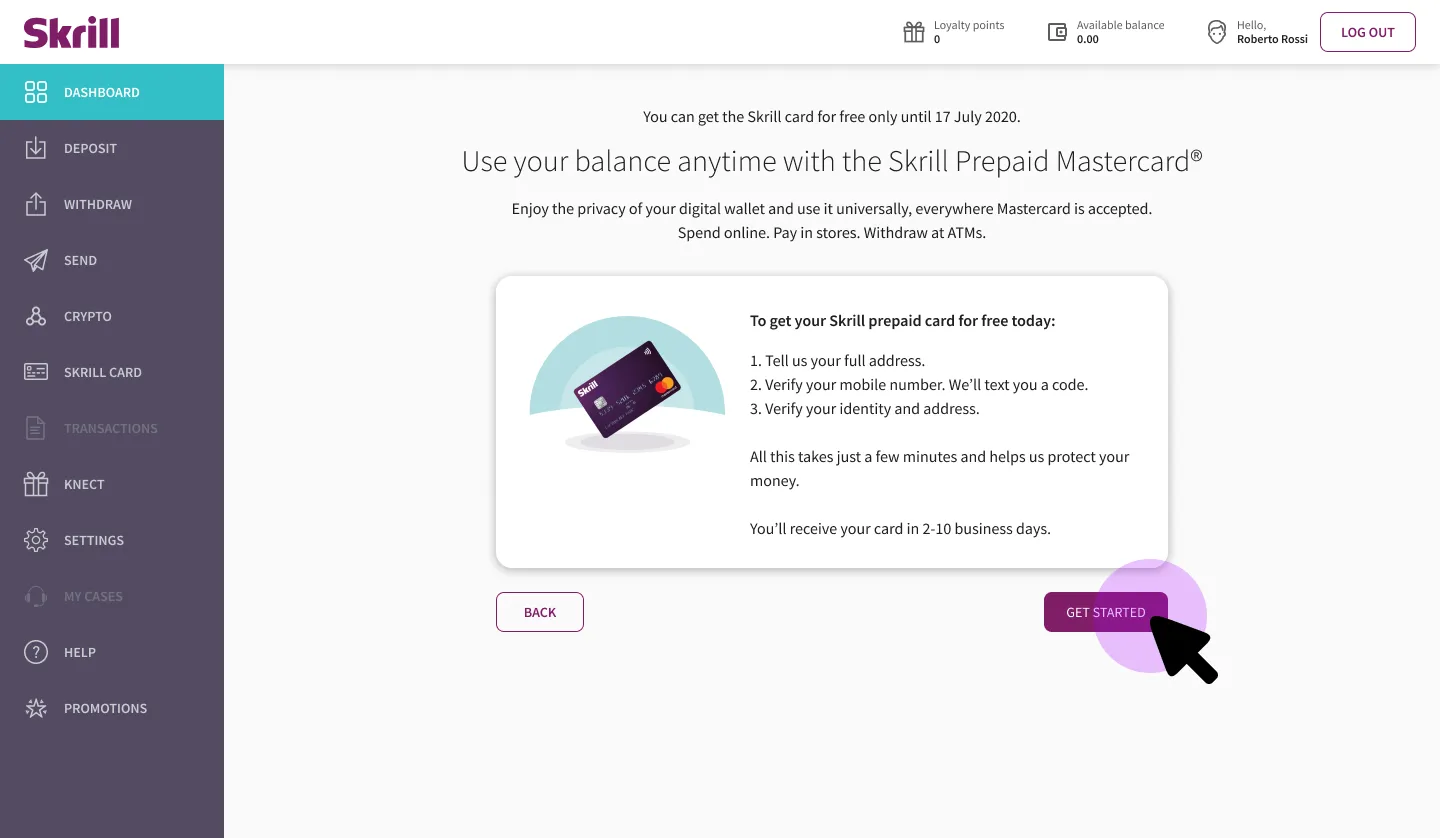
What replaced the deposit screen: a direct three-step path to a free card.
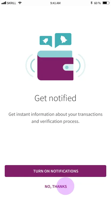
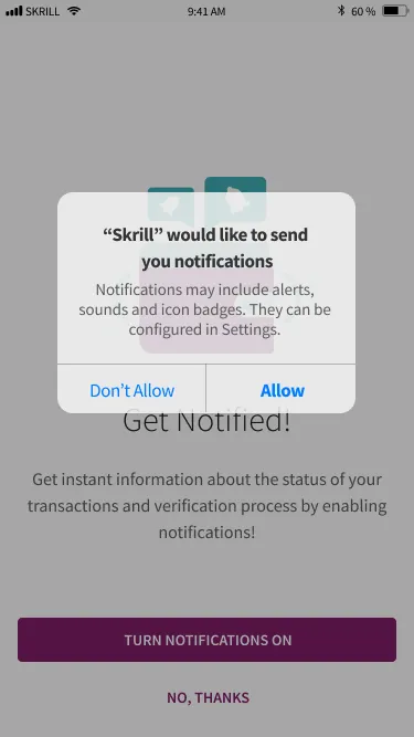
The rest was rebuilding both journeys against the shorter flow. Mobile was not a resize. Touch targets, input order, and the hierarchy on each screen were reworked for how people hold a phone, with SCA and KYC through Jumio. Italian needs 20 to 30% more room than English, so every screen was checked again after translation.
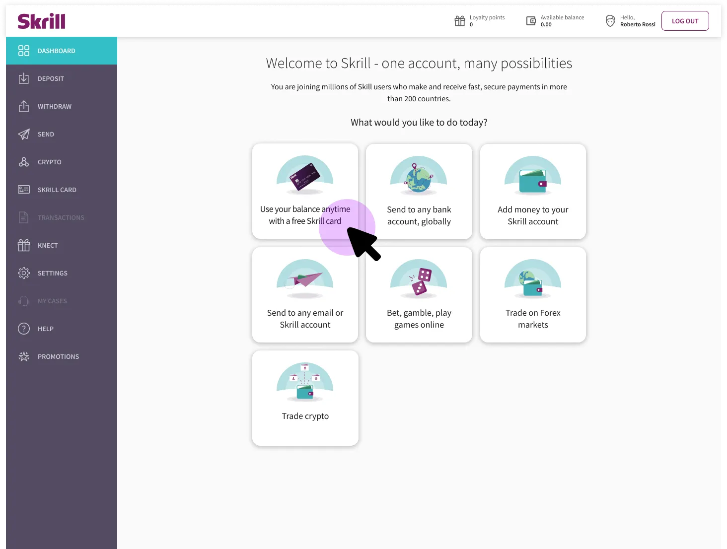
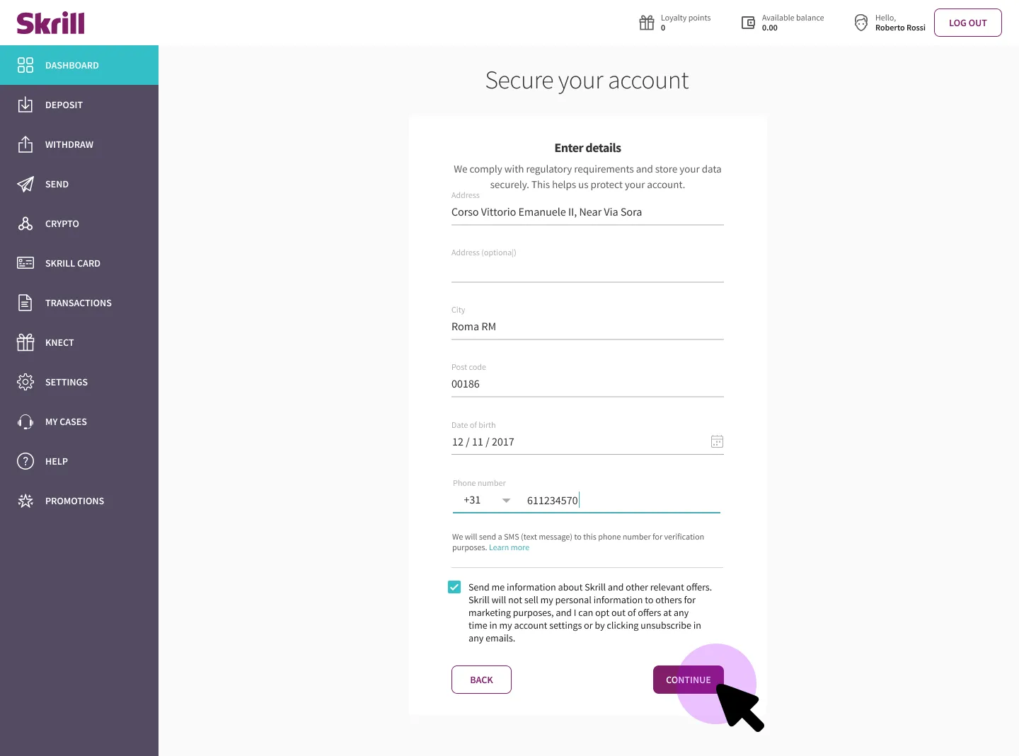
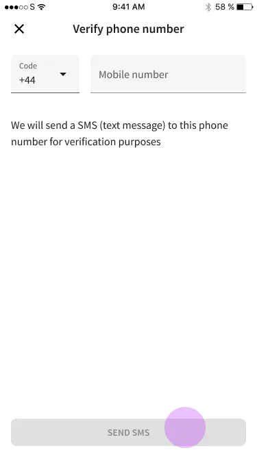
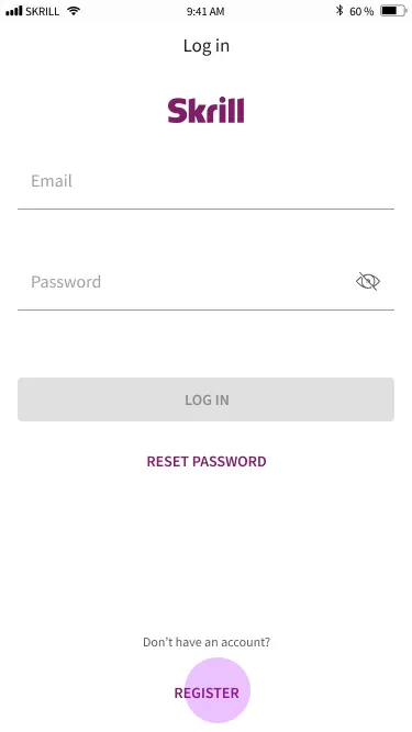
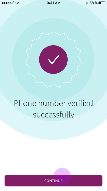
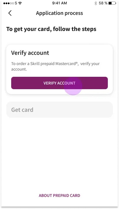
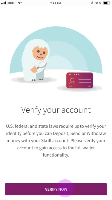
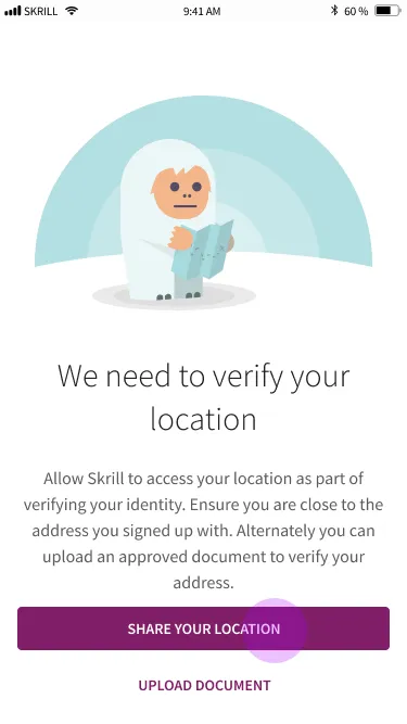
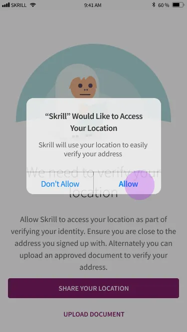
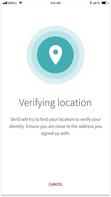
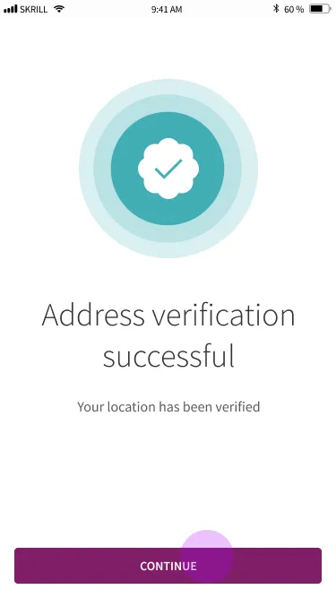
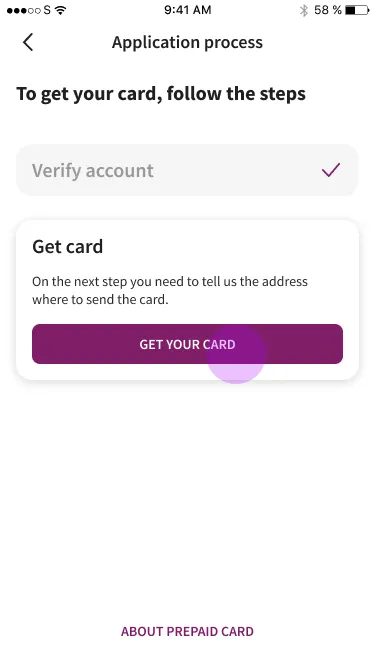
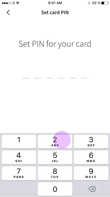
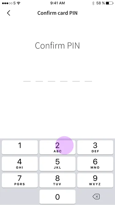
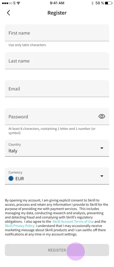
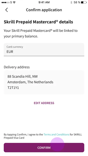
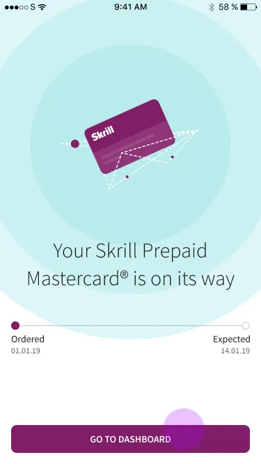
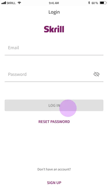
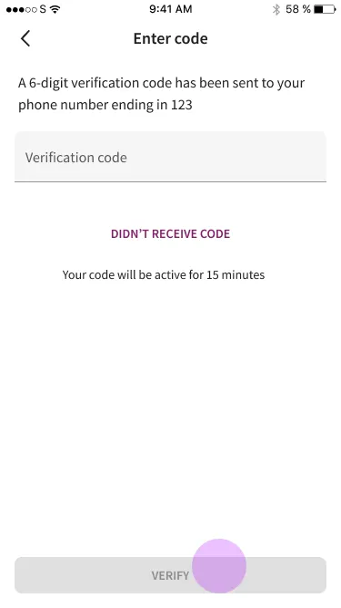
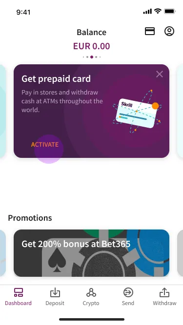
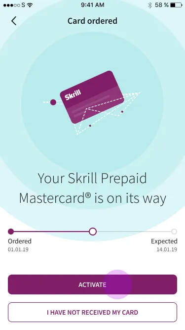
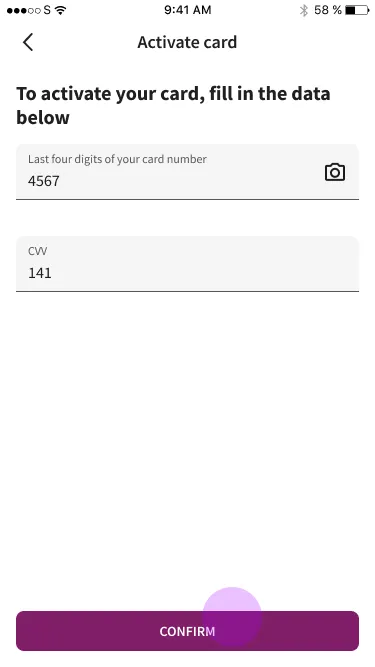
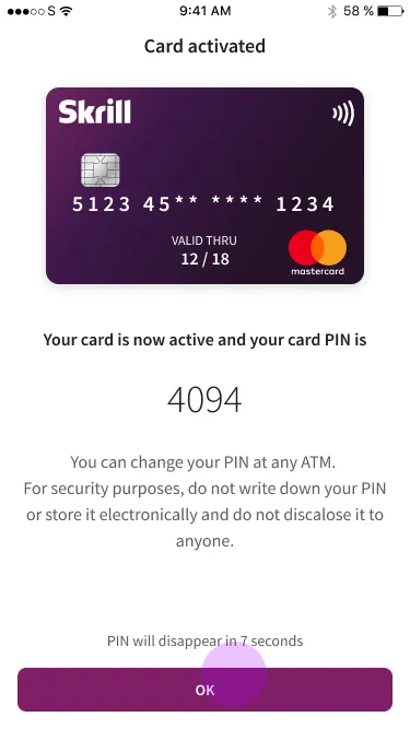
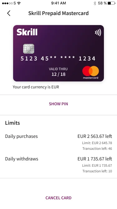
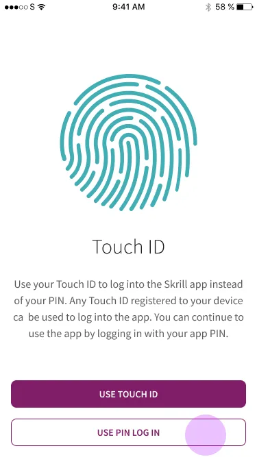
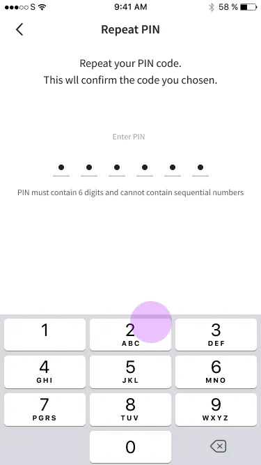
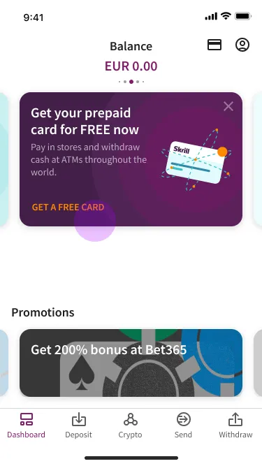
The complete archived sequence shows how registration, verification, ordering, and activation connected on a phone.
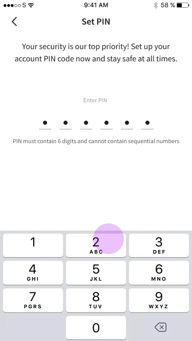
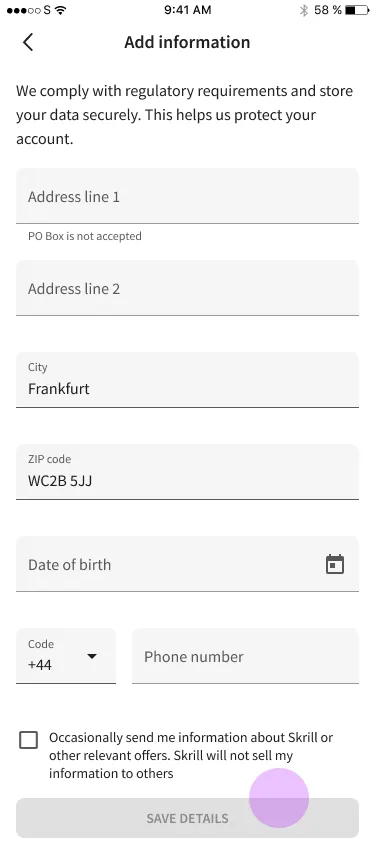
No interactive build survives from this project - these are archived screens from the shipped mobile flow.
Localization gaps survived a successful launch
We could not localize identity verification for Italy in time, so Italian users were verified against rules written for U.S. federal and California law, considerably stricter than they needed to be.
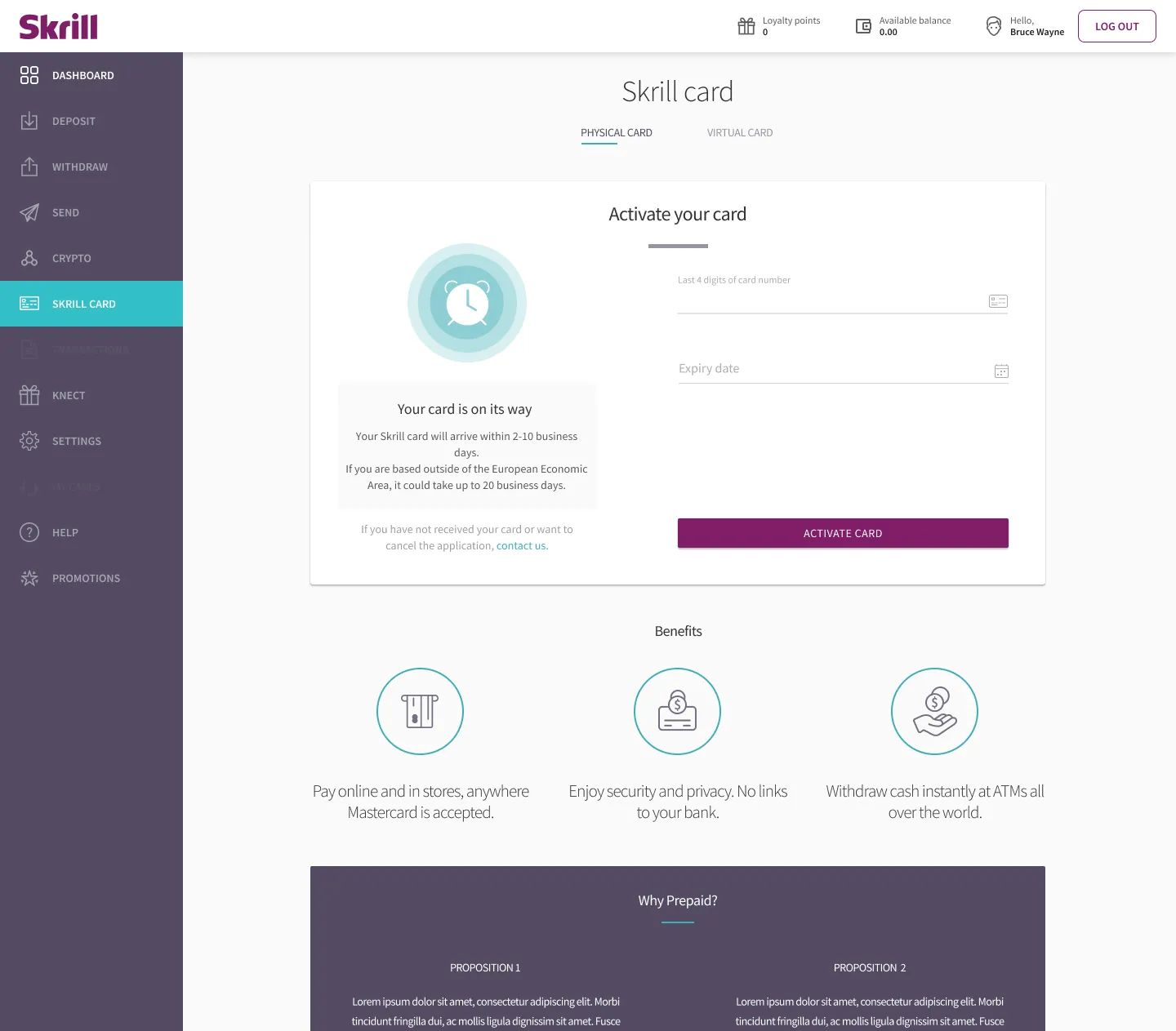
Card PIN creation never got unified. On desktop, users could not choose their own card PIN and had to remember an assigned one. People wrote them down somewhere unsafe, or confused the card PIN with the wallet PIN. That generated support problems long after launch.
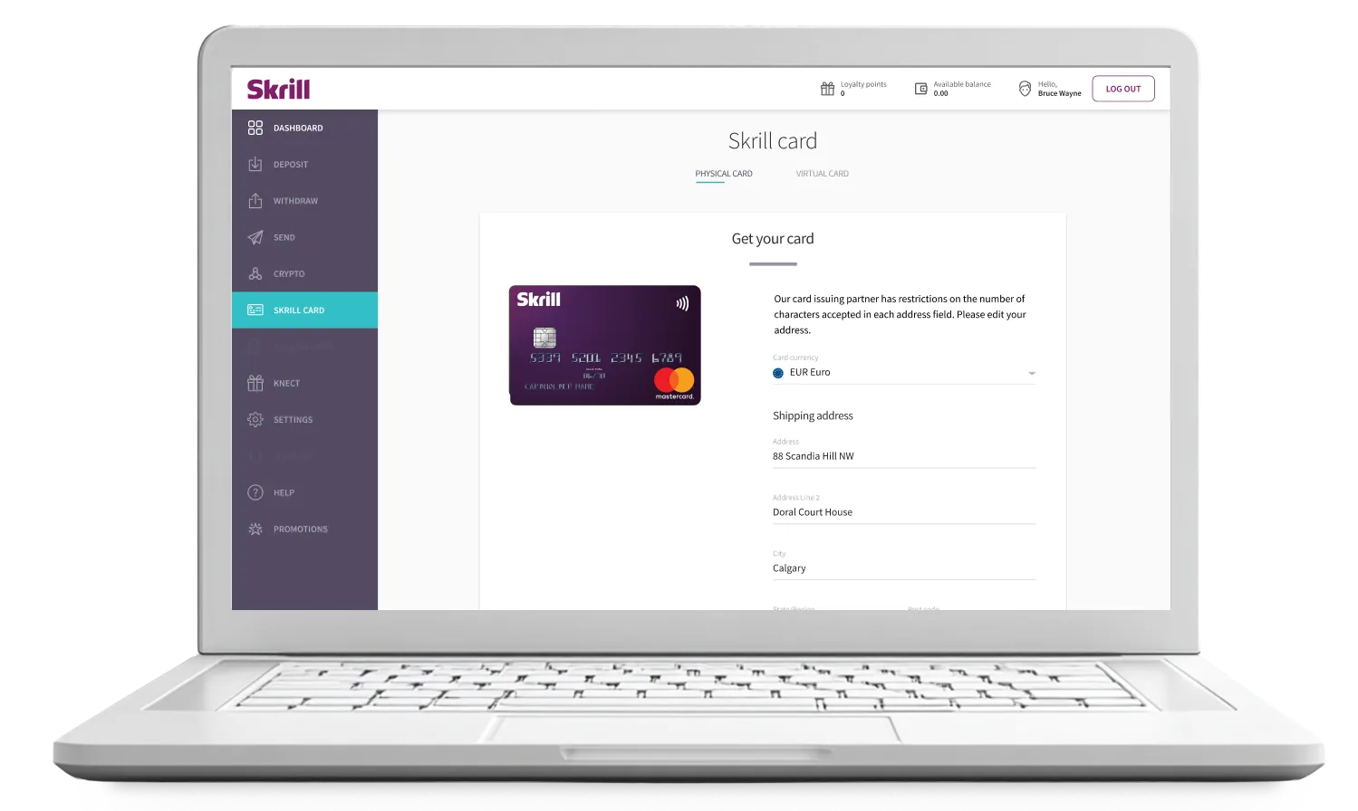
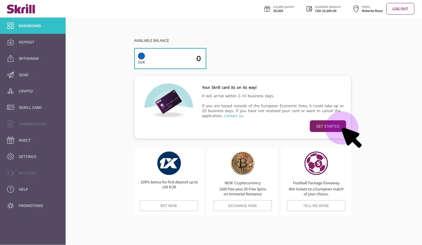
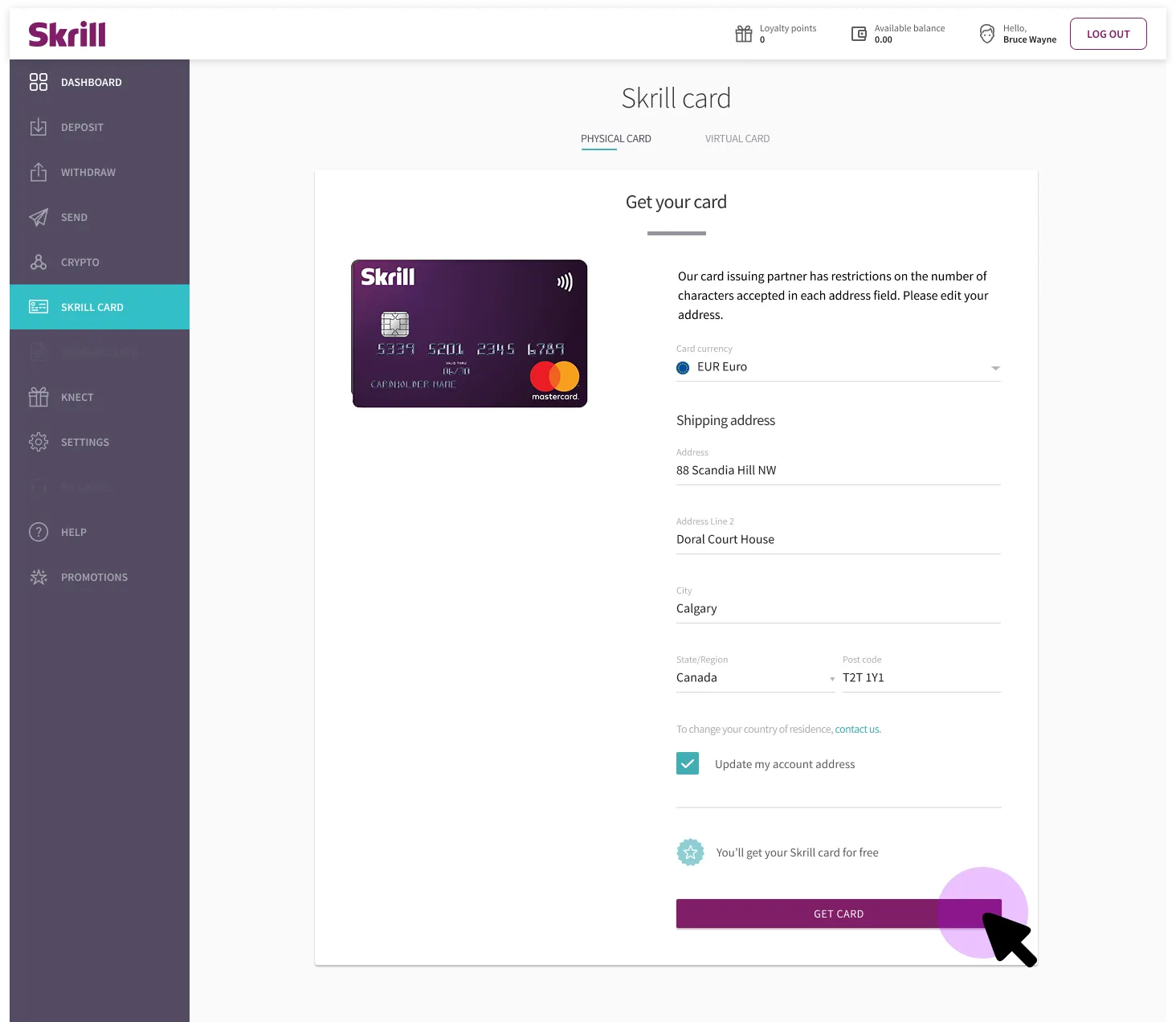
We wanted a direct handoff from verification to the card page. The code freeze made it impossible, so we dropped users on the dashboard with a contextual banner nudging them onward. It worked. It is a compromise, not a design.
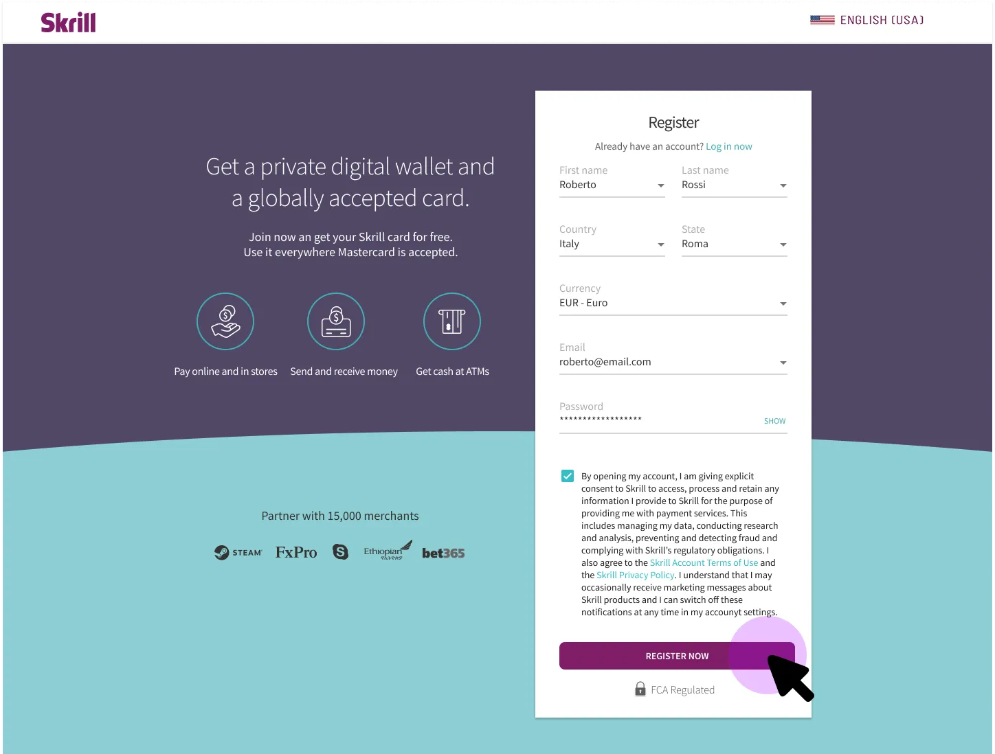
The original desktop and campaign screens make that handoff—and the compromise—visible in context.
Two structural things cost us time. Mobile and desktop were owned by different teams, and getting them to concede enough for one coherent experience took longer than the design work. And the campaign assets did not arrive until days before the TV spot aired, so most of the build happened against placeholders. That second one is the same seam I hit again at Income Access, from the other side: the gap between design and go-to-market is where both projects lost the most.
The fixed media date and code freeze reversed the usual relationship between campaign and product.
With more runway I would have put the shared journey map in front of every team on day one, not just UX. Its absence was a symptom of the silos, not a documentation gap. I would also have fixed a cadence for measuring NPS after launch instead of treating it as something we would get to.
A shorter journey delivered 25,000 applications
Cumulatively the campaign delivered more than 25,000 applications and 16,000 activations, and the project broke even at 400,000 euros. All three targets met, inside thirty days, over the holidays, during a company-wide code freeze.
The deposit removal was subsequently rolled out to other low-risk markets. Interest held through the following months until COVID cancelled the sports calendar.