2019–2021
600+ components across 500+ branded environments
A decade of product growth had created duplicated patterns, accessibility problems, and technical debt while the underlying platform was also being modernized.
- Role
- UX lead over two designers, one front-end developer, two copywriters
- Duration
- 20 months
- Teams
- Five development teams, Montreal and Varna
- Scale
- 500+ branded operator environments
A shared design system gave hundreds of brands an accessible baseline while allowing the platform and its technology to change progressively.
What changed
- Affiliate signup success rate
- 29%from not measured before the redesign
- Component library
- 600+ components on Atomic Design principlesfrom no shared library; each team building its own patterns
- Affiliate manager retention
- 63% at the point of researchfrom the figure that moved priority from new capability to fixing existing capability
- Affiliate feature concentration
- 1% of features generated 80% of interactionsfrom measured with Pendo to prioritize the system
- Affiliate-manager feature concentration
- 5% of features generated 80% of interactionsfrom measured with Pendo to prioritize the system
Executive summary. Income Access had grown for more than a decade into a complex multi-brand platform with duplicated styles, accessibility issues, and technical debt. I led UX for a shared design system and accessibility baseline while five development teams continued shipping and the underlying platform was being modernized. The system grew to 600+ components supporting more than 500 branded environments, with governance and validation practices designed to keep new work consistent as the technology changed.
One system had to support more than 500 brands
Income Access is a white-label affiliate marketing platform. Every operator who licenses it wants their own brand on it, which by 2019 meant more than 500 distinct branded environments running on one product.
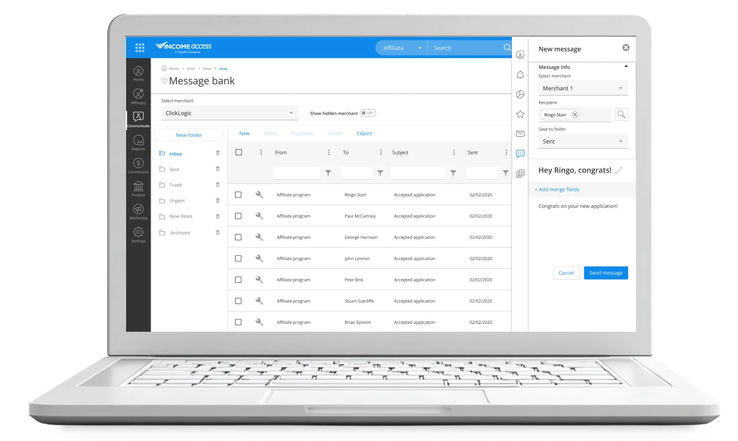
The platform this all had to hold together across 500+ branded environments.
That is the constraint that makes this a systems problem rather than a redesign. Several development teams were building in parallel across commissions, ad serving, reporting, payments, CRM, and onboarding. Without something holding them together, the platform would drift into 500 slightly different products, and it already had: the interface had grown by accretion, with navigation logic that differed by section and features layered on features.
The inconsistency was operational, not cosmetic.
The platform also decides what people earn. Reporting, attribution, and commission payouts determine affiliate income and operator acquisition cost. An interface that behaves differently in two places is not an aesthetic problem there. It is a reason to stop trusting the numbers.
Usage data revealed where consistency mattered most
Building 600 components is easy to justify and hard to defend. Pendo analytics gave us the argument.
For affiliates, 1% of features drove 80% of interactions. For affiliate managers, 5% drove the same 80%.
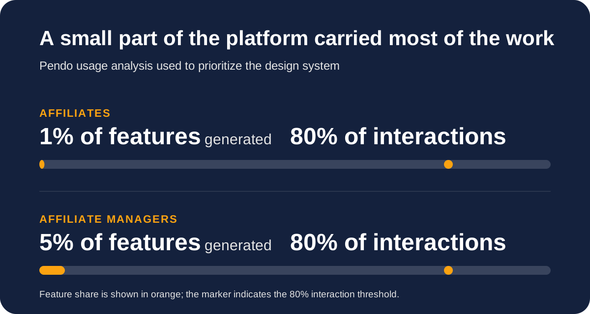
The evidence changed the order of work: depth for the few workflows carrying most activity, consistency for the long tail.
That told us where the system had to be excellent and where it only had to be consistent. Path analysis showed the neglected areas were blocked rather than unwanted, so the components serving reporting and registration management got the most attention.
Alongside the analytics I ran interviews and testing through Maze, and trained customer support agents to run lightweight usability tests during their scheduled client calls. That gave the system a continuous stream of evidence without adding headcount, and it put people in front of research questions outside a scheduled session, which I had learned to value on DocBoss.
Brand freedom could not come at the cost of access
Here is where white-labelling stops being a theming exercise.
Many operator brand colours failed WCAG contrast requirements. Full colour customization, which is what every operator wanted, would have shipped systematic accessibility failures across hundreds of environments simultaneously. One decision, replicated 500 times.
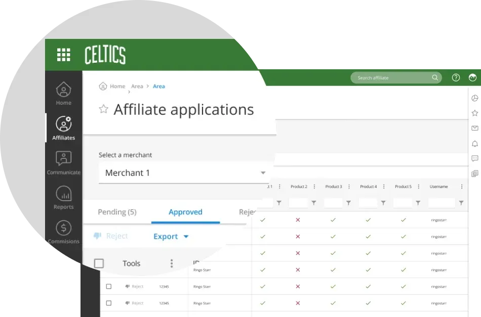
The answer was a constrained customization model. Primary and secondary brand colours apply to navigation, where brand recognition does almost all of its work. Everything else holds an accessible baseline that does not move. Operators get an environment their users recognize. Affiliates get an interface that stays legible no matter whose brand they are working under that day.
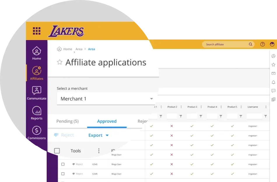
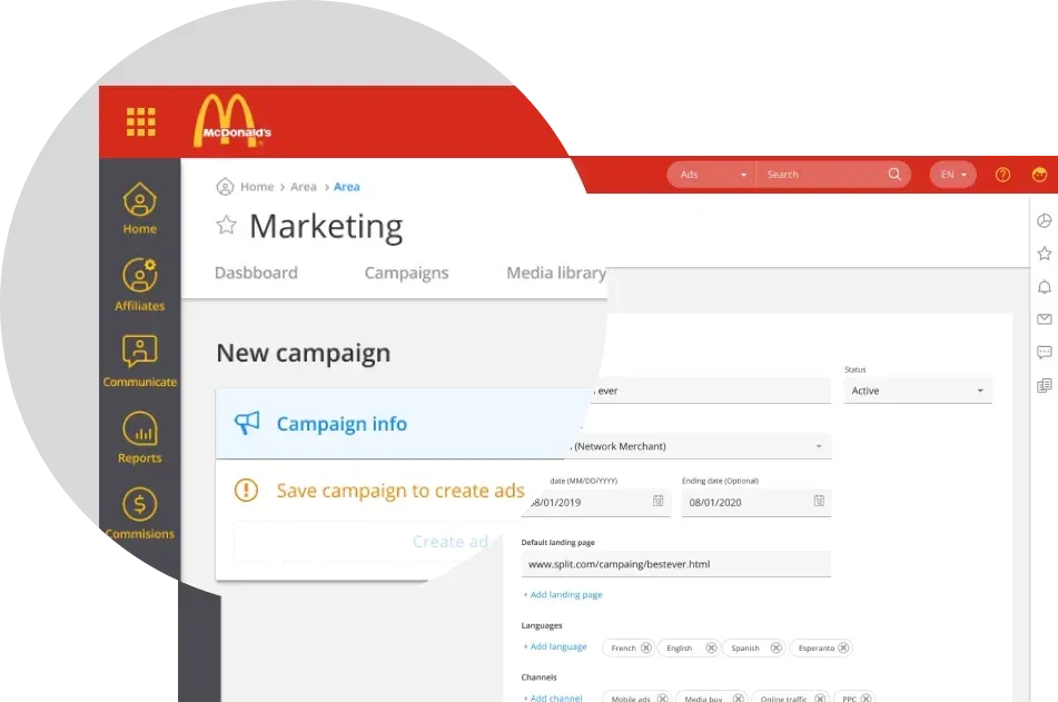
Three of 500+ operator brands, same accessible baseline underneath every one.
Shared criteria turned a library into a system
A component library with no governance becomes a suggestion. Customization requests arrive constantly on a platform like this, and each one is reasonable on its own.
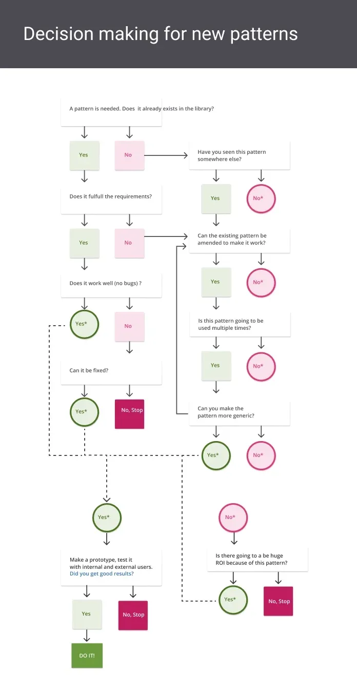
I introduced a shared decision framework for deciding when to reuse, adapt, test, or create a pattern. That moved stakeholder conversations from opinion to principle, and it changed what the design team was doing in those meetings. We were no longer defending taste or gatekeeping. We were applying criteria everyone had agreed to.
The library needed rules for deciding what deserved to become shared infrastructure.
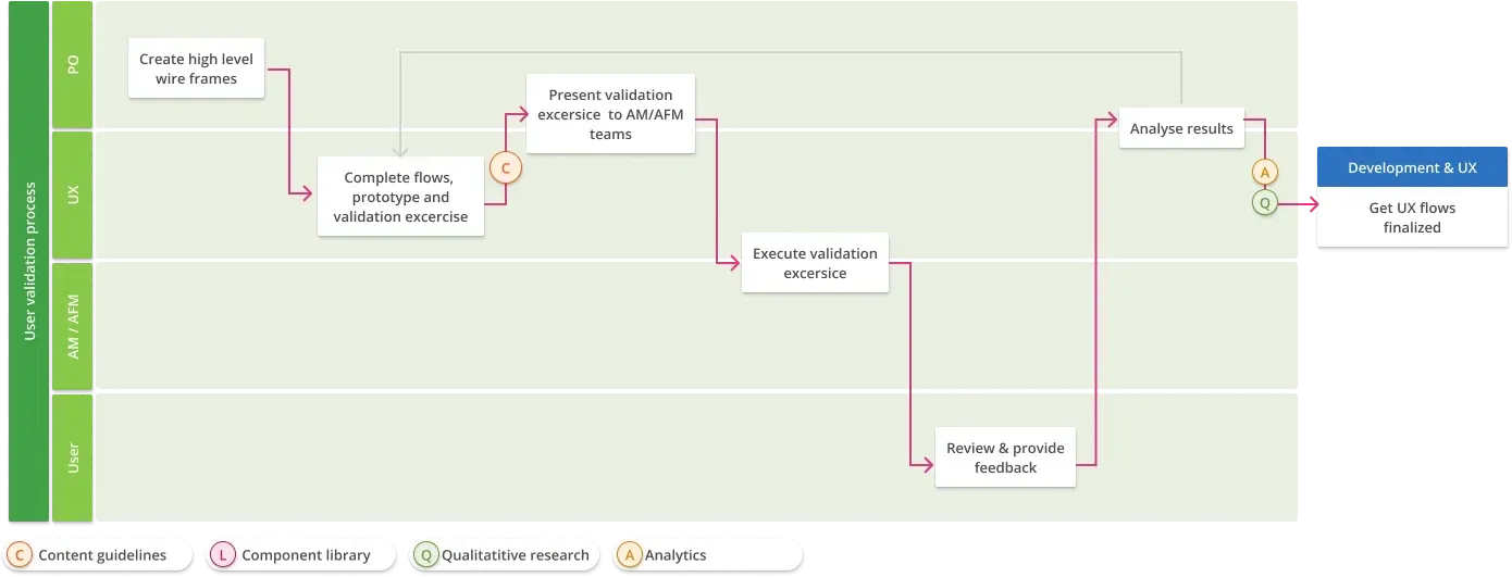
Getting a component approved was one thing; getting a whole flow validated before it reached engineering was another. Product, UX, account-facing teams, and users each had a defined role in moving a proposal from high-level wireframes to an evidence-backed flow.
The process made research part of delivery rather than a separate phase. The library’s largest effect turned out to be organizational rather than visual. It gave design and engineering a shared vocabulary, which cut the negotiation cost on every feature and let five teams move independently without diverging.
Two users made 600 components easier to prioritize

Sasha — Affiliate manager. Manages onboarding, campaign performance, and compliance. She needs clear reporting to act quickly.

Ringo — Affiliate. Tracks clicks, registrations, and commissions. He needs absolute confidence in the numbers.
Together, they became the shared language for prioritizing the 600-component design system.
Migration had to protect people while they got paid
People were using this to get paid while we were changing it. Two mechanisms handled that. Users could switch between the new and legacy interfaces at any point, which removed the fear of being stranded and told us which patterns were landing. And single sign-on replaced the separate URLs and credentials affiliates had been juggling across operator brands.
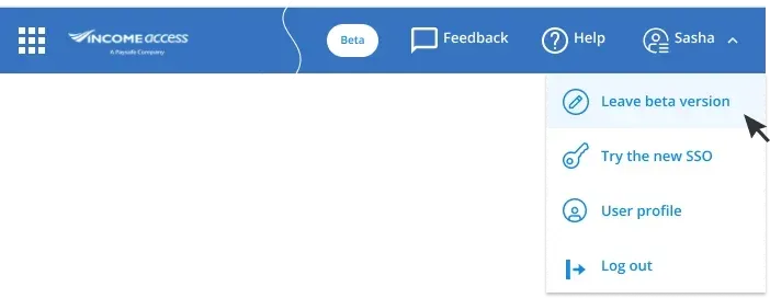
Both exits stayed one click away, right where the account menu already lived.
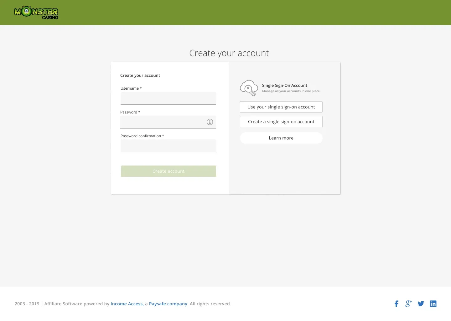
Before SSO, each operator brand meant a separate login - this is the screen that started unifying them.
Migration had to protect hundreds of branded environments at once.
A safe fallback could not replace communication
We built the transition mechanisms and skipped the transition.
The beta toggle and single sign-on were the right calls. What we did not build was the thing around them: a customer success team with an actual release plan, communications drafted ahead of the change, and go-to-market work timed to land before the interface did rather than after.
The consequence is specific to a platform where people get paid. Affiliates and managers encountered a redesign of the tool that determines their income without having been told beforehand why it was changing, what it would do for them, or when. A toggle lets somebody retreat from a change. It does not explain the change. When the explanation is absent, the toggle stops being reassurance and becomes the safer default, and adoption of work that is genuinely better stalls on nothing but unfamiliarity.
Trust was the guiding principle of the whole project. We applied it rigorously inside the interface and then failed to apply it to the moment users met the interface.
What I would do now is treat release communications as part of the design scope, not a marketing handoff. Who tells users, how far ahead, in what sequence, and what specifically improves for them. That planning has to start months before launch, and it needs a named owner outside the design team.
The system succeeded by making variation legible
Value in complex systems is never evenly distributed. A small number of workflows carry most of the weight, and data finds them faster than intuition does.
The project also broke a design instinct I had: simplify by removing variability. Income Access was built to be customizable, and that was the point. The job was not to eliminate variation but to make it legible, so the underlying logic held no matter how a client had configured it.
The result was not a platform with more features. It was one people believed.